Pricing Analytics for Health Plans
Since January 1, 2021, when the CMS’s hospital price transparency rule took full effect, health insurance companies have theoretically had access to the prices hospitals around the country have negotiated for shoppable services.
In practice, though, hospital pricing data is nearly impossible to view – never mind analyze – in the format in which it lives on hospital websites.
With the analytics capabilities that we make available, however, health insurance companies can meaningfully compare, analyze, and interrogate pricing data from hospitals around the country.
Let’s look at some examples of what’s possible with access to our analytics tools, powered by Google Looker.
In order to load live Looker data if you are using Safari, ensure that your privacy settings allow for cross website tracking. This can be found under Privacy in Safari Preferences.
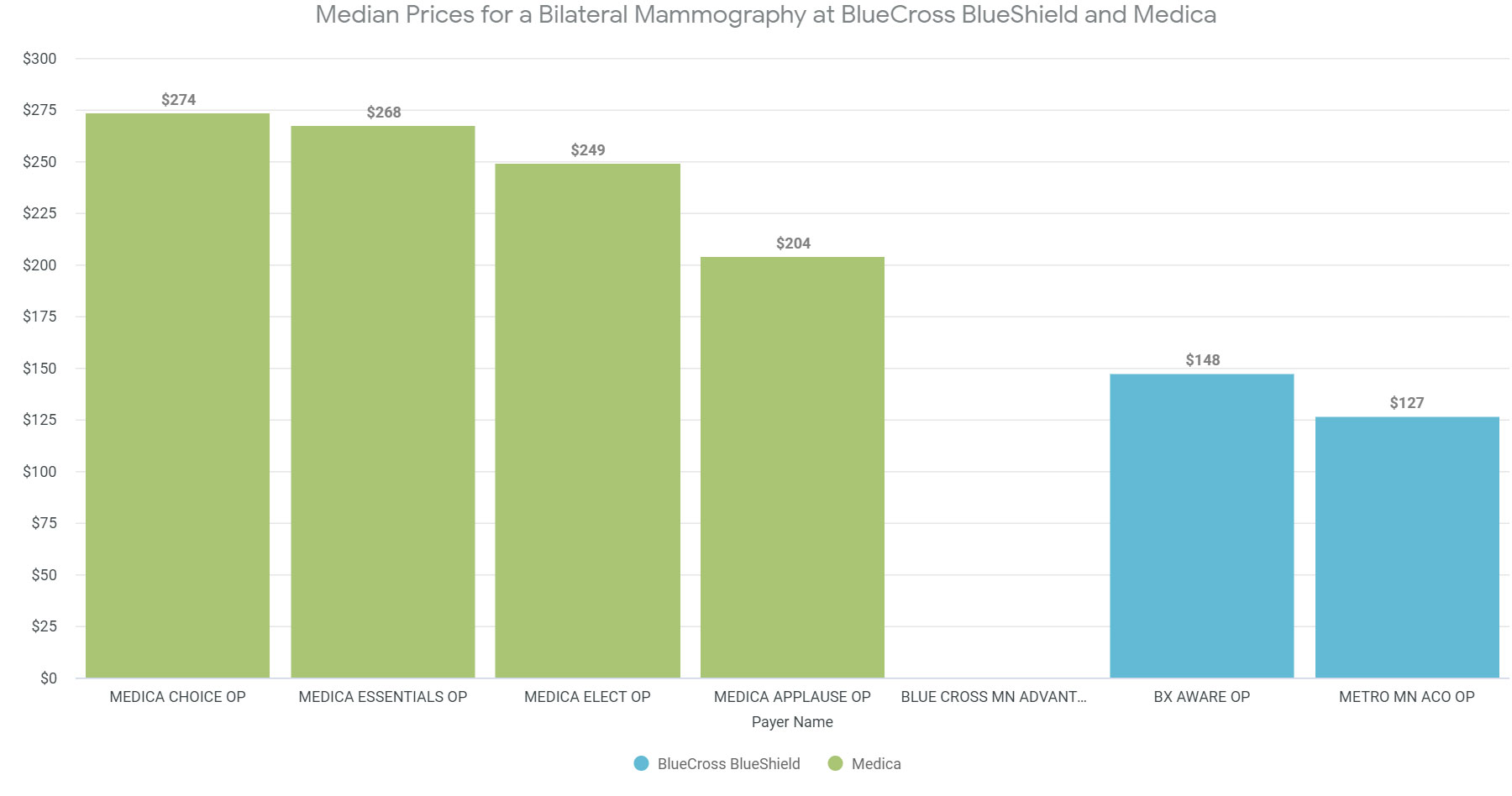
Medica vs. BCBS Prices for Mammography in Greater Minneapolis
For these visualizations, we looked at the prices charged by two insurers (BlueCross BlueShield and Medica) at five hospitals in the greater Minneapolis area for bilateral mammography services (one of the 70 shoppable services whose prices hospitals are required to publish).
The image is static, but live data is available by clicking on the button
As this graph shows, prices vary both from payer to payer and among plans offered by a single payer. In other words, both Medica and BCBS negotiate various rates on their various plans and the prices vary significantly among Medica and BCBS plans.
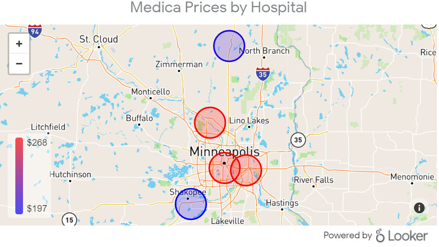
Now let’s look at a geographical breakdown of prices.

The image is static, but live data is available by clicking on the button
The image is static, but live data is available by clicking on the button
In the first map, we see that BlueCross BlueShield’s median negotiated prices are higher at hospitals in the Minneapolis suburbs and lower at city-based hospitals.
In the second map, we see that the situation is reversed for Medica plans: median mammography prices are higher in the city and lower in the suburbs.
This kind of insight can inform an insurance provider’s price negotiations – and it represents only a tiny fraction of what our analytics platform makes visible.
We’d love to give you a better sense of how our analytics capabilities can help you visualize the data that matters most to you. Get in touch, and we can set up a custom demo.